Alice has definitely and without a doubt been the most ambitious and challenging project we have ever done. From its very inception it was imagined as a boast; a way for us to show what we are capable of when there are (almost) no constraints.
As many of you already know, we decided to make a switch to lettered and numbered editions with Alice and therefore introduce Matching Rights. Like with Dracula – Transylvania Edition, first we developed a book that will become the numbered edition of Alice. The reason we tend do it like this is because we don’t want to create an “ultimate” (lettered) edition and then take things away from it in order to create a numbered edition. Instead, we upgrade the already amazing book to new heights. Focusing on doing things this way results something truly special, as can be seen with Alice.
The development process, however, was a wild ride to the very end, partly because we surpassed the scope of the book, partly due to unavoidable pandemic conditions that have affected pretty much everyone, and partly because of the two series of big earthquakes here in Zagreb that have somewhat affected our suppliers. In this article I’ll share some insights into the development process. Keep in mind that this process was over a year long, so I’m only going to mention some highlights of the production challenges, since trying to cover everything would be a book in and of itself.
Alice Checkmate
As mentioned earlier, there are two editions of Alice: Jabberwock Edition and Bandersnatch Edition. While the former is everything we ever dreamed it would be, the latter is where things got a little crazy. This was mostly due to the idea that we should include the themes from both sequels with the book, but done in our own way. The first theme was the oversized deck of cards. Because we wanted to put the reader into Alice’s shoes with PoV illustrations, this also reflected upon the card which are made too big for adult hands, just like regular cards would be too big for child’s hands. But the second theme was a bit trickier, since we wanted it to be inspired by the special chess variant called Alice Chess as well. Now, we didn’t want to just slap on any chess along with the book and call it a day, we wanted to make the book an integral part of the chess.
That is how our own version of Alice Chess was made, which hides the book, or rather its slipcase, in one of the boards. Not only that, but it conveniently stores the figures around the boards, making it easy not only to play, but also to open the chess set, since the storage area is made in such a way that chess pieces simply “transfer” to the side that is on the bottom. Furthermore, the boards can be taken out to play if you don’t want to wrestle with the heavy set and you can even play checkers using only the pawns.
Speaking of weight, there are two main reasons why the whole set weighs about 30 kg. The first one is that the set is not assembled from small boards like you would see in most chess sets. Instead, a few large pieces of highly praised Slavonian oak were fused and then the set was carved into it, adding the engravings later on, so what you see is actually full high quality wood. The second reason is that the chess pieces are made out of copper and stainless steel, both polished to high shine. That is why we will ship two pairs of cotton gloves with each set, but there is nothing preventing you from playing without them if you don’t mind the fingerprints or if you don’t mind polishing them every so often. Both sets were imagined as reflective in nature, to further emphasise the looking-glass world, and were designed in such a way that they are vertically symmetrical for the exact same reason. However, copper receives patina over time, especially if handled often by naked hand. Some people prefer the patina, some prefer the shine, but in any case the patina can be removed with an appropriate polishing agent.

We had several incarnations of prototypes of the chess set until we reached the final one. In the beginning it included a lot of mechanics, but we ended up streamlining the design to make it more user friendly. In the end, simple and smart design wins every time.
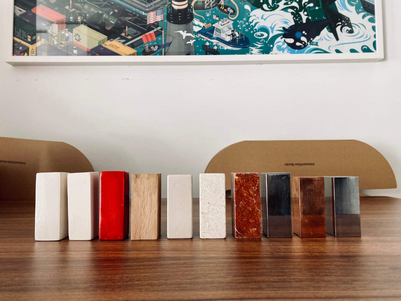
Chess pieces had a similar path. We started with 3D printing, then we tried ceramics, then wood, then stone, then marble, then finally giving the metals a go (we even tried spraying the metals, but in the end opted for high polish only). Even though there was some fear that the pieces will be too heavy, it turned out the weight was just right.
Looking back, it’s no wonder it took us so long, with or without the pandemic and earthquakes. Of course, these conditions didn’t help, but when working on something like these, time is a crucial ingredient and certain things can’t be rushed.
Oh What a Tangled Web We Weave
Another interesting tidbit that ended up heavily influencing the development is that during the research phase we found out that Dodgson was a huge math nerd. He was also big on logic, which kind of makes sense that he tried to break or at least bend those in his work. We wanted to somehow translate that to the covers, so the closest thing we found to that in the real world were optical illusions. That is why we used thematically inspired optical illusions on front and back covers of both Jabberwock Edition and Bandersnatch Edition.
In order to further emphasise the effect, we decided not to print them, but to weave them using the Jacquard technique. It consists of weaving hundreds upon hundreds of small threads in order to create the illustration.
This required months of testing to get it just right, but the effect it creates drastically surpasses that of a print. Which leads us to the final part of this story…
Not Everything Needs to Be Printed
Of course, we didn’t stop at the covers (why make life easy, eh?). We thought that the title for Bandersnatch Edition deserved some special attention as well, because you can’t just print the title for something beautifully weird like Alice in Wonderland & Through the Looking-Glass. I mean, you can, but… you shouldn’t! At least not for the lettered edition.
So for the title we decided to use shimmering ink, which is used in fountain pens and is ridiculously pretty. These inks often include multiple colours and even glitter! The colour we opted for was Inferno Orange, which suited the orange-red covers extremely well. This ink was used for both titles, designation and signatures by me and the illustrator Damir Mazinjanin. Needless to say, the Looking-Glass title was written backwards so it can only be properly read when pointed to a mirror, which was the main reason why it took a grand total of 16 hours to title all of the Bandersnatch Editions by hand, as well as signing and assigning designations for both the lettered and the numbered edition.
Details, Details, Details,
As you probably noticed, we do enjoy putting a lot of (sometimes even highly conceptual) details into our books. Some of these we reveal, some of these we leave for people to find out themselves. It might seem like too much to some, but nothing beats that joy when someone sends us an email to let us know they found it.
I believe Alice is an exception of sorts when it comes to our editions. We don’t plan to make every book so… over-the-top. But when it came to Alice, we just had to.


![20241023 [NEWS] Amaranthine Odyssey - Paper](https://amaranthinebooks.com/wp-content/uploads/2024/10/20241023-NEWS-Amaranthine-Odyssey-Paper-150x150.webp "20241023 [NEWS] Amaranthine Odyssey – Paper")